The "New Crown Treasury''
Basic information
Project Title
The "New Crown Treasury''
Full project title
The "New Crown Treasury''
Category
Prioritising the places and people that need it the most
Project Description
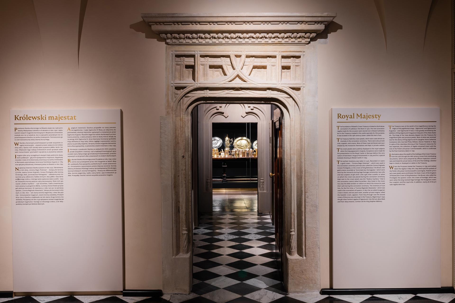
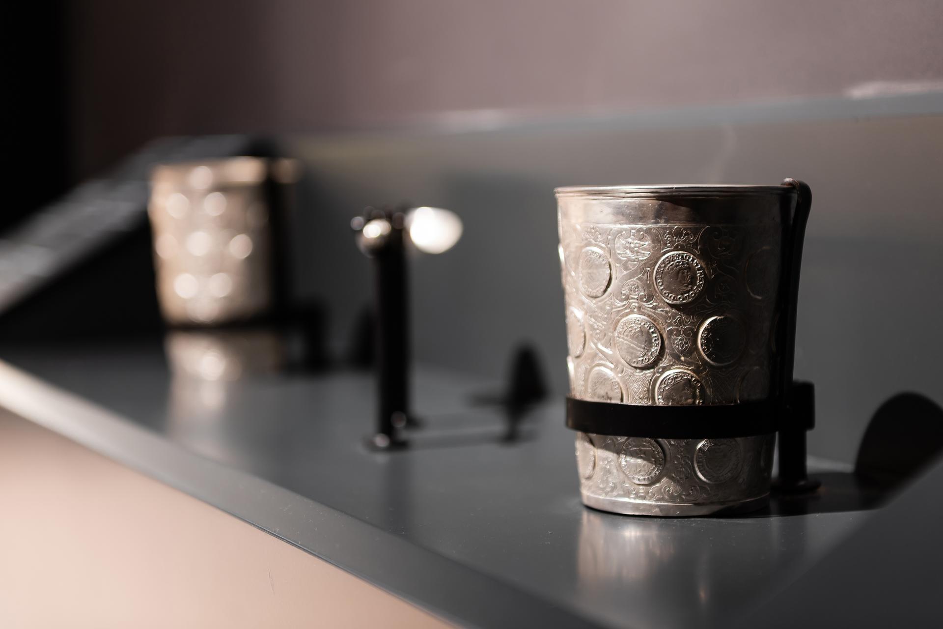
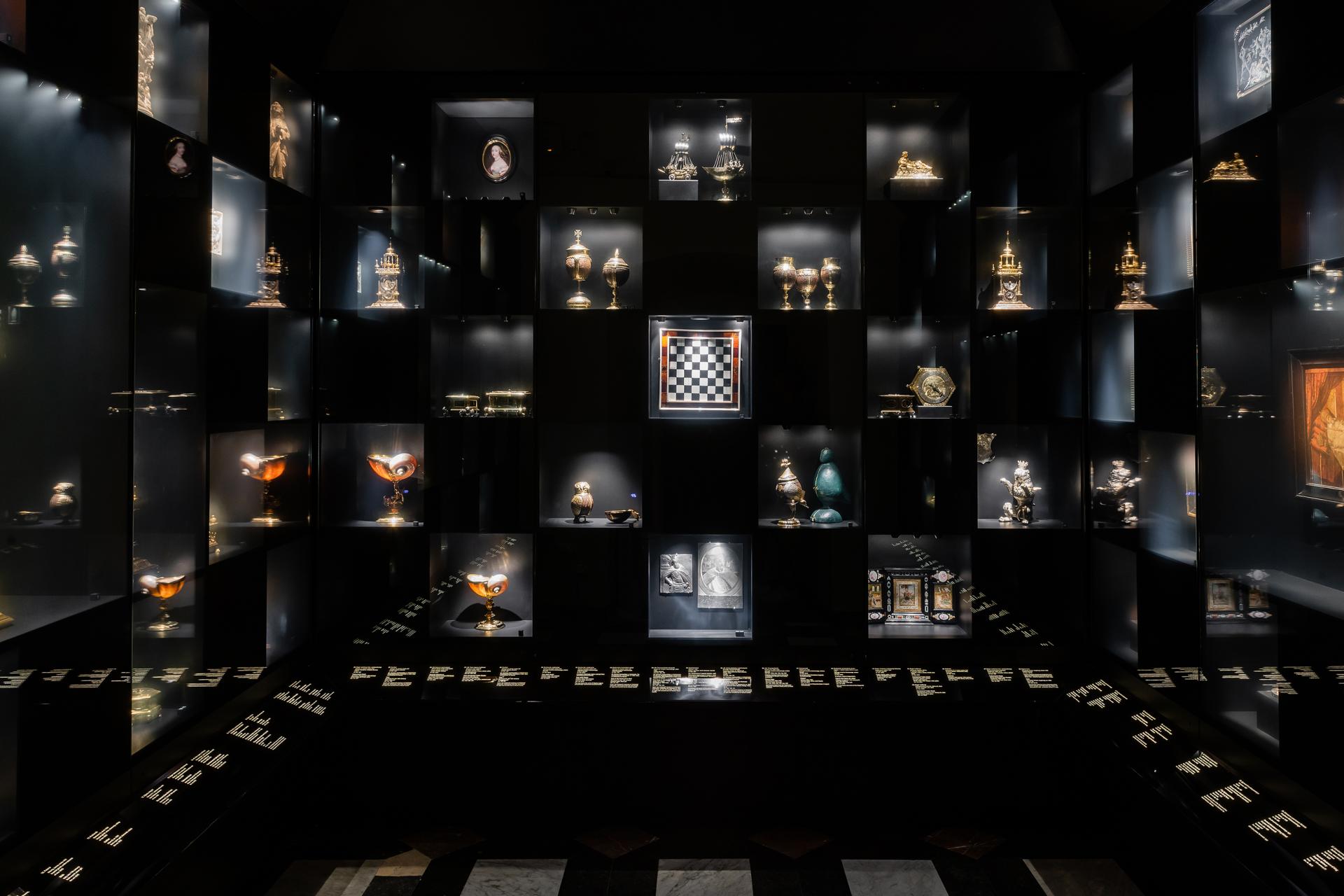
The "New Crown Treasury'' consists of 12 rooms filled with the most important and valuable items in the Royal Wawel Castle's collection. The arrangement of the exhibition is minimalistic and mysterious – it emphasizes the rank and uniqueness of the presented exhibits. The play of light and shadows is not only the crucial visual element of the project, but it is also its main design idea. The arrangement discreetly emphasizes the historic interiors and draws attention.
Geographical Scope
National
Project Region
Lesser Poland, Upper Silesia, Poland
Urban or rural issues
Mainly urban
Physical or other transformations
It refers to a physical transformation of the built environment (hard investment)
EU Programme or fund
Yes
Which funds
ERDF : European Regional Development Fund
Description of the project
Summary
The "New Crown Treasury'' consists of 12 rooms filled with the most important and valuable items in the Royal Wawel Castle's collection. The arrangement of the exhibition is minimalistic and mysterious – it emphasizes the rank and uniqueness of the presented exhibits.
The play of light and shadows is not only the crucial visual element of the project, but it is also its main design idea. Objects emerge from the dark. The arrangement discreetly emphasizes the historic interiors and draws attention to the most important objects. Simple, minimalistic forms of display elements are made of precious materials and constitute a background for the most important "heroes" of the exhibition. All in an elegant way that harmonizes with historic interiors. Gold shimmers and appears in the details of the arrangement – in the carriers of visual information and typography or details of the showcases.
The permanent exhibition is timeless, but diverse enough to be interesting each time and inspire viewers to rediscover it. The visitor explores objects and curiosities like an adventure seeker or archaeologist. The arrangement encourages independent discovery of the treasures.
All photo credits Radoslaw Kazmierczak
Key objectives for sustainability
The key objectives are:
inclusive design;
comprehensive design for the whole range of users: both visitors and staff;
display & lighting design;
complementary visual identity: logo, posters, outdoor and internet graphics;
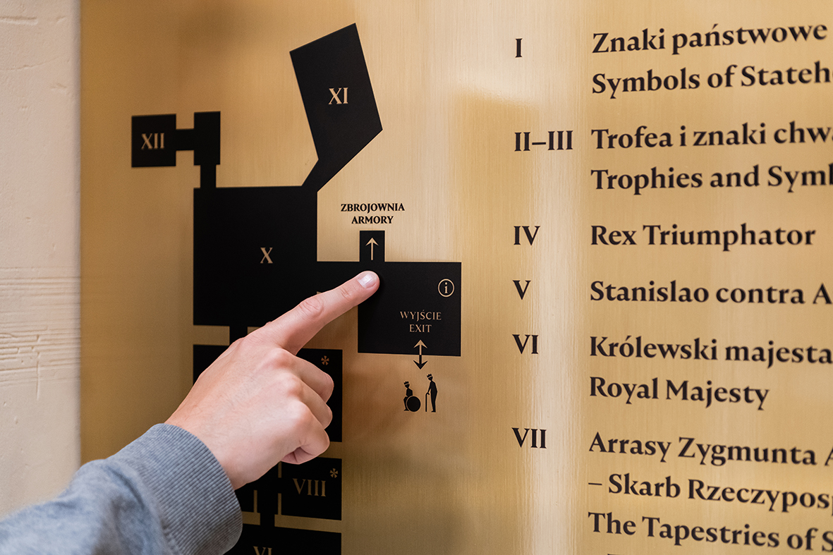
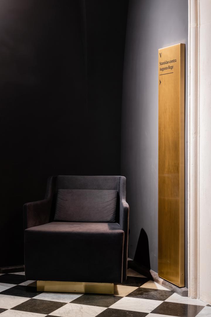
elements of communication design: maps and pylons – users can easily find themselves in the space;
personalized educational items – dedicated to young and mature users;
personalized pieces of furniture – dedicated to the staff;
durability – the exhibition is designed with highest quality materials
inclusive design;
comprehensive design for the whole range of users: both visitors and staff;
display & lighting design;
complementary visual identity: logo, posters, outdoor and internet graphics;
elements of communication design: maps and pylons – users can easily find themselves in the space;
personalized educational items – dedicated to young and mature users;
personalized pieces of furniture – dedicated to the staff;
durability – the exhibition is designed with highest quality materials
Key objectives for aesthetics and quality
In every room there is one most important exhibit, chosen as a visual highlight. For example in the second room where the bridles are the most important exhibit, replicas of horses are the most visible element, additionally surrounded with mirrors to emphasize the impression. The whole arrangement of the last room is arranged like a chessboard - every object is in a niche and together they compile a chessboard pattern. The visitor has the impression of being inside the game.
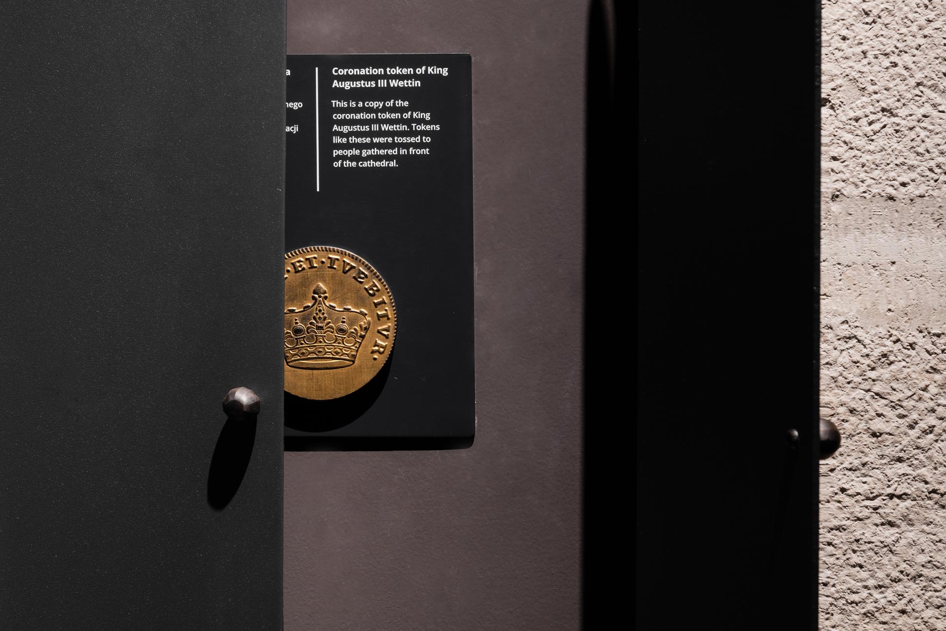
Educational elements also appear in the exhibition space e.g. replicas of objects or sound elements. Solutions are convenient for all users. A path with hidden coins was created for the youngest visitors. Children have to find them along the sightseeing route. Replicas of some objects were created for the blind and visually impaired. They are also an educational element used by the staff during museum lessons. Besides that, there are some tactile graphics along the route. Typography is presented in high contrast to be legible. Moreover, the size of fonts was adapted to the dark environment. Ergonomic, comfortable seats have been designed specifically for museum employees, who can use them during work. The staff can hide personal belongings or a bottle of water in the back pockets of the armchairs. On the exhibition route there are also some discreet seats for the visitors. Visual identification of the exhibition was an important part of the project and included the logo of the exhibition and the promotional campaign. Logo design was inspired by the embroidery on the most important object of the whole exhibition – the Mantle of a Knight of the Order of the Holy Spirit, which was a gift from the French king Louis XIV to the Polish king John III Sobieski. Promotional campaign which included posters, citylights, banners, advertisement poles, billboards, internet materials and invitations, showed particular objects from the Treasury.
Educational elements also appear in the exhibition space e.g. replicas of objects or sound elements. Solutions are convenient for all users. A path with hidden coins was created for the youngest visitors. Children have to find them along the sightseeing route. Replicas of some objects were created for the blind and visually impaired. They are also an educational element used by the staff during museum lessons. Besides that, there are some tactile graphics along the route. Typography is presented in high contrast to be legible. Moreover, the size of fonts was adapted to the dark environment. Ergonomic, comfortable seats have been designed specifically for museum employees, who can use them during work. The staff can hide personal belongings or a bottle of water in the back pockets of the armchairs. On the exhibition route there are also some discreet seats for the visitors. Visual identification of the exhibition was an important part of the project and included the logo of the exhibition and the promotional campaign. Logo design was inspired by the embroidery on the most important object of the whole exhibition – the Mantle of a Knight of the Order of the Holy Spirit, which was a gift from the French king Louis XIV to the Polish king John III Sobieski. Promotional campaign which included posters, citylights, banners, advertisement poles, billboards, internet materials and invitations, showed particular objects from the Treasury.
Key objectives for inclusion
The key objectives of the project in terms of inclusion:
1. The exhibition is for everybody;
2. The staff is as important as visitors. They finally have an ergonomic place of work (specially designed pieces of furniture).
3. There are different paths to visiting the exhibition. Content is interesting for the youngsters, professionals and common visitors.
4. Educational elements also appear in the exhibition space e.g. replicas of objects or sound elements. Solutions are convenient for all users.
5. Typeface Nocturne was chosen due to its elegance and correspondence with the feeling of the exhibition. The typeface is legible and accessible to all users.
Results in relation to category
The exhibits are better presented and more accessible for all visitors. The collection is presented in consistent character. The permanent exhibition is timeless, but diverse enough to be interesting each time and inspire viewers to rediscover it. The visitor explores objects and curiosities like an adventure seeker or archaeologist. The arrangement encourages independent discovery of the treasures.
How Citizens benefit
The "New Crown Treasury'' shows the most important exhibits in the Wawel Royal Castle and in Poland itself. The heritage has to be shown in the best accessible way to all citizens.
Physical or other transformations
It refers to a physical transformation of the built environment (hard investment)
Innovative character
Some educational stations have sound recordings. Films and multimedia animations complement the presentation of objects. We use the technology to underline the beauty of the collection. In the "Kunstkamera" room the objects show up and hide because of implementing the interactive glass solution. The chessboard gifted to the king plays a prominent role here, while other exceptional objects were arranged in a chessboard pattern. Visitors can see all the items at the same time in a sequence or a selected section of the collection (e.g. only jewelry).
Disciplines/knowledge reflected
Disciplines and/ or knowledge fields:
product design;
exhibition design;
history;
conservation of monuments;
text redation;
photography;
graphic design;
wayfinding;
prevention of monuments;
management;
architecture;
craft;
multimedia.
product design;
exhibition design;
history;
conservation of monuments;
text redation;
photography;
graphic design;
wayfinding;
prevention of monuments;
management;
architecture;
craft;
multimedia.
Methodology used
How do we work?
Our work is an inclusive process with clients. Usually it contains a workshop with a client and an in-depth analysis of the space as well as objects' history. We work in interdisciplinary teams to make the design complete and accessible. That is why we work on both displays and graphic design. Functional solutions for all groups of users are paramount to us.
Our work is an inclusive process with clients. Usually it contains a workshop with a client and an in-depth analysis of the space as well as objects' history. We work in interdisciplinary teams to make the design complete and accessible. That is why we work on both displays and graphic design. Functional solutions for all groups of users are paramount to us.
How stakeholders are engaged
The restoration of "New Crown Treasury'' was financed by the Polish Government and European Union. In the process were involved many specialists, such as curators, exhibition designers, light designers, architects, monument restorers, constructors, project managers, directors of the Wawel Royal Castle, local authorities.
Global challenges
The prevention of national heritage is one of the most important parts of culture. That is why it requires an appropriate setting. We did our best to present the objects in the best way. Objects emerge from the dark. The arrangement discreetly emphasizes the historic interiors and draws attention to the most important objects. Simple, minimalistic forms of display elements are made of precious materials and constitute a background for the most important "heroes" of the exhibition. All in an elegant way that harmonizes with historic interiors. Gold shimmers and appears in the details of the arrangement – in the carriers of visual information and typography or details of the showcases.
Learning transferred to other parties
The design is unique for the Royal Castle but the methodology of our work is always the same. We believe that accessible design is good design. In designing, we focus on creative and functional solutions. We want visitors to feel good in the spaces we design and that the space is accessible to various recipients. It is important for us to choose visual means appropriately to the subject.
Keywords
design
accessibility
rearrangement
high quality
durability