Budepast Umbrella Brand Identity Design
Basic information
Project Title
Full project title
Category
Project Description
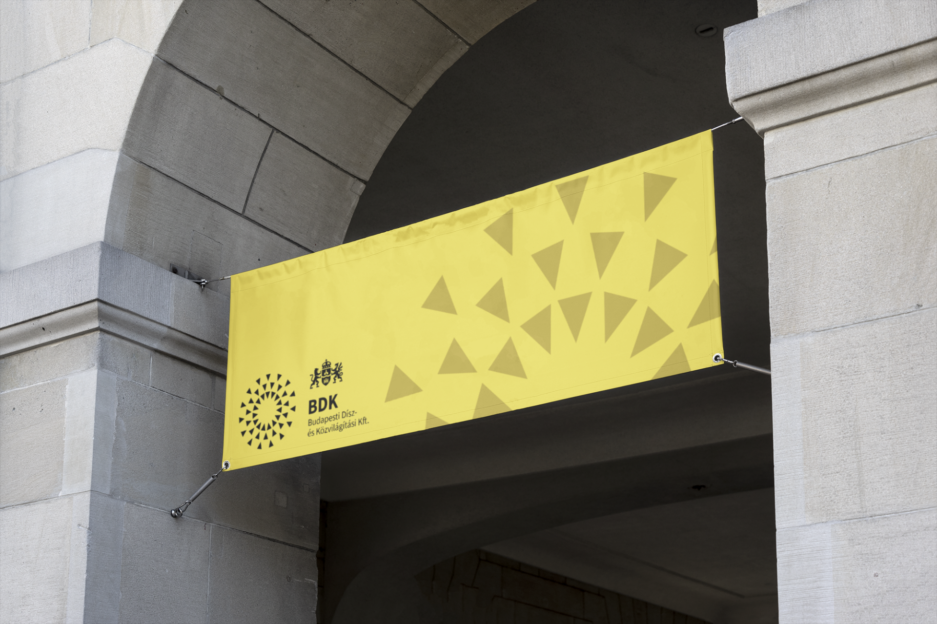
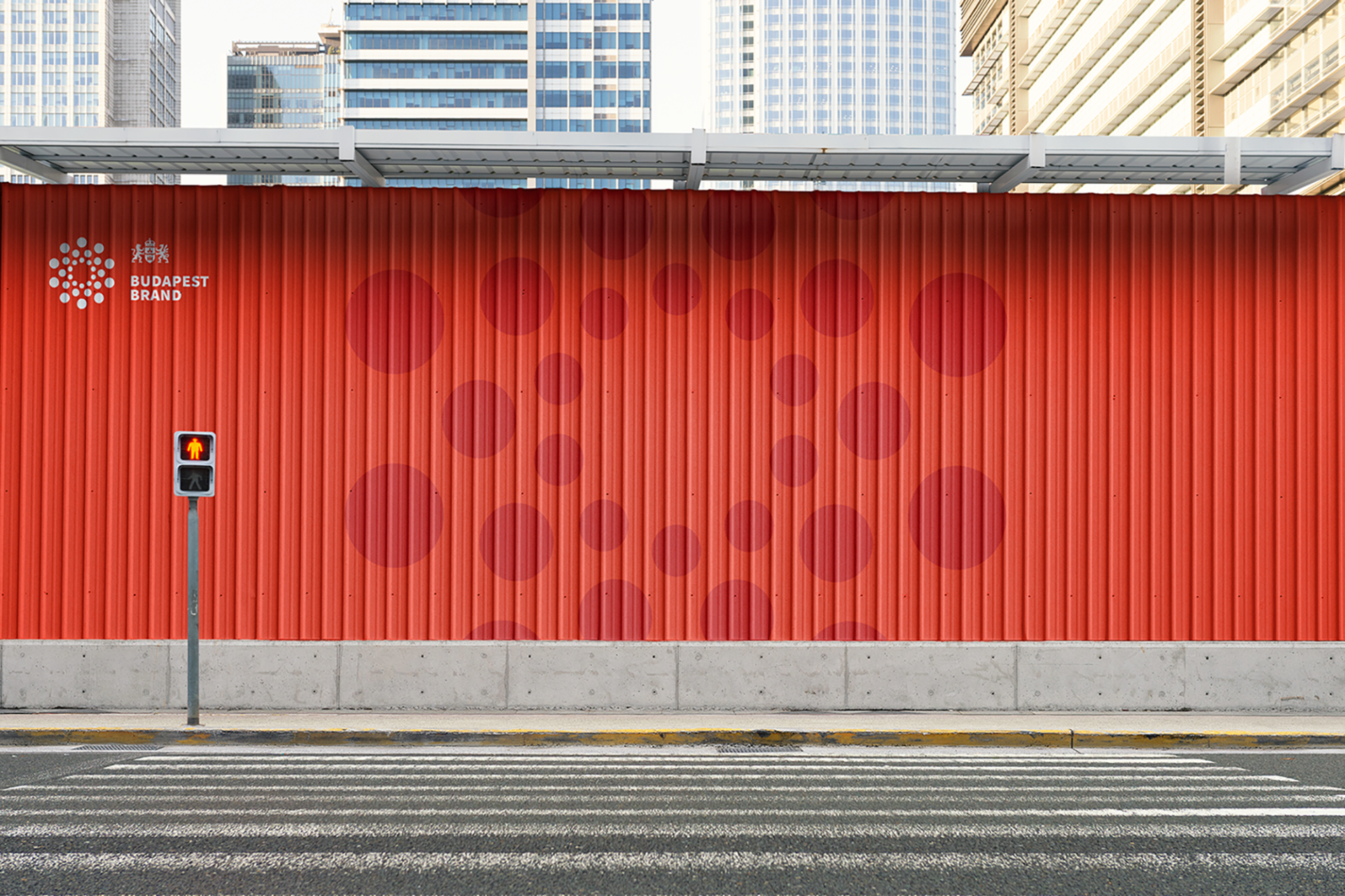
The emblem of a metropolis can be seen in countless different places, ranging from enormous billboards to the thin strip banners of the commuting buses.
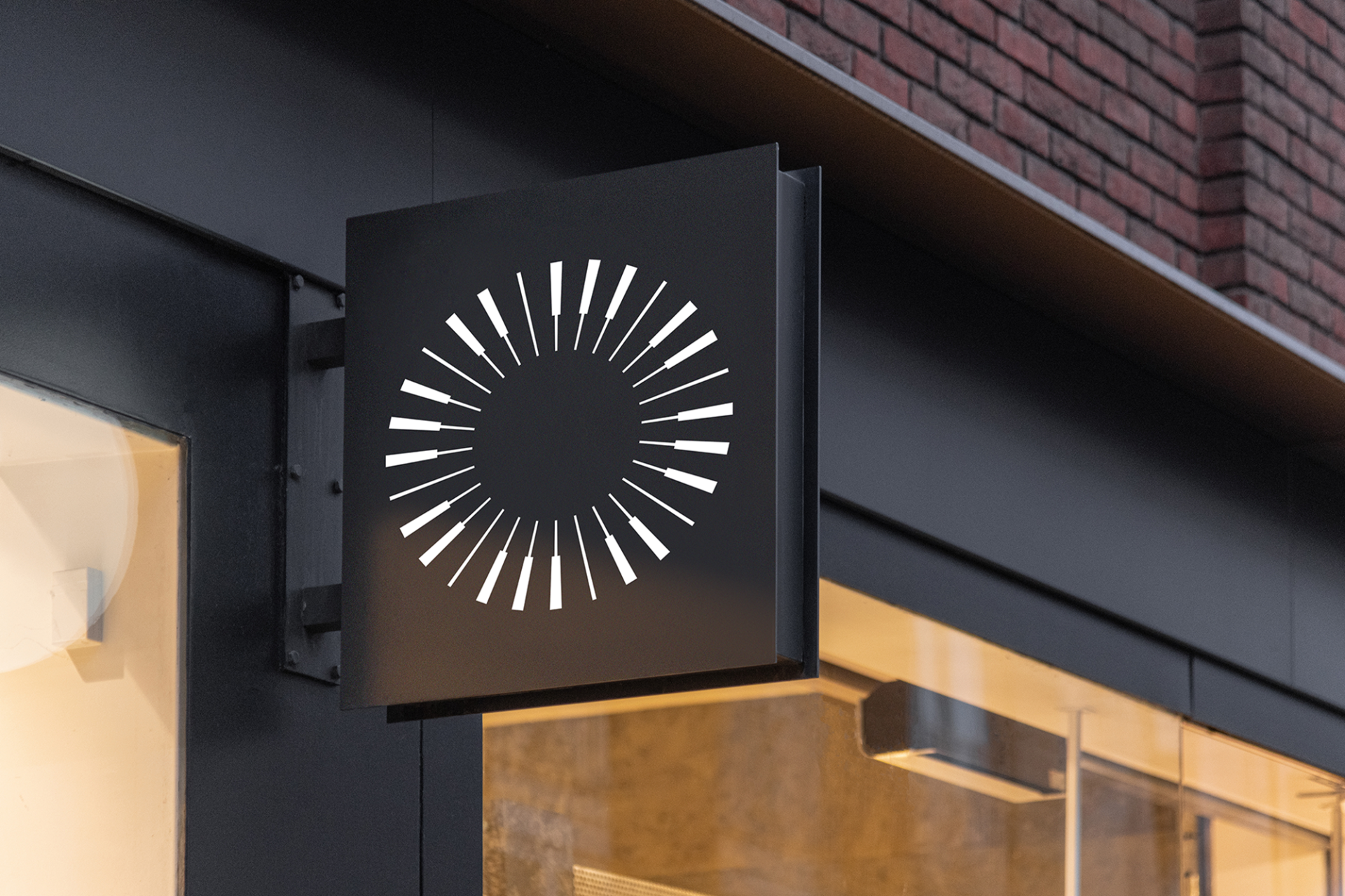
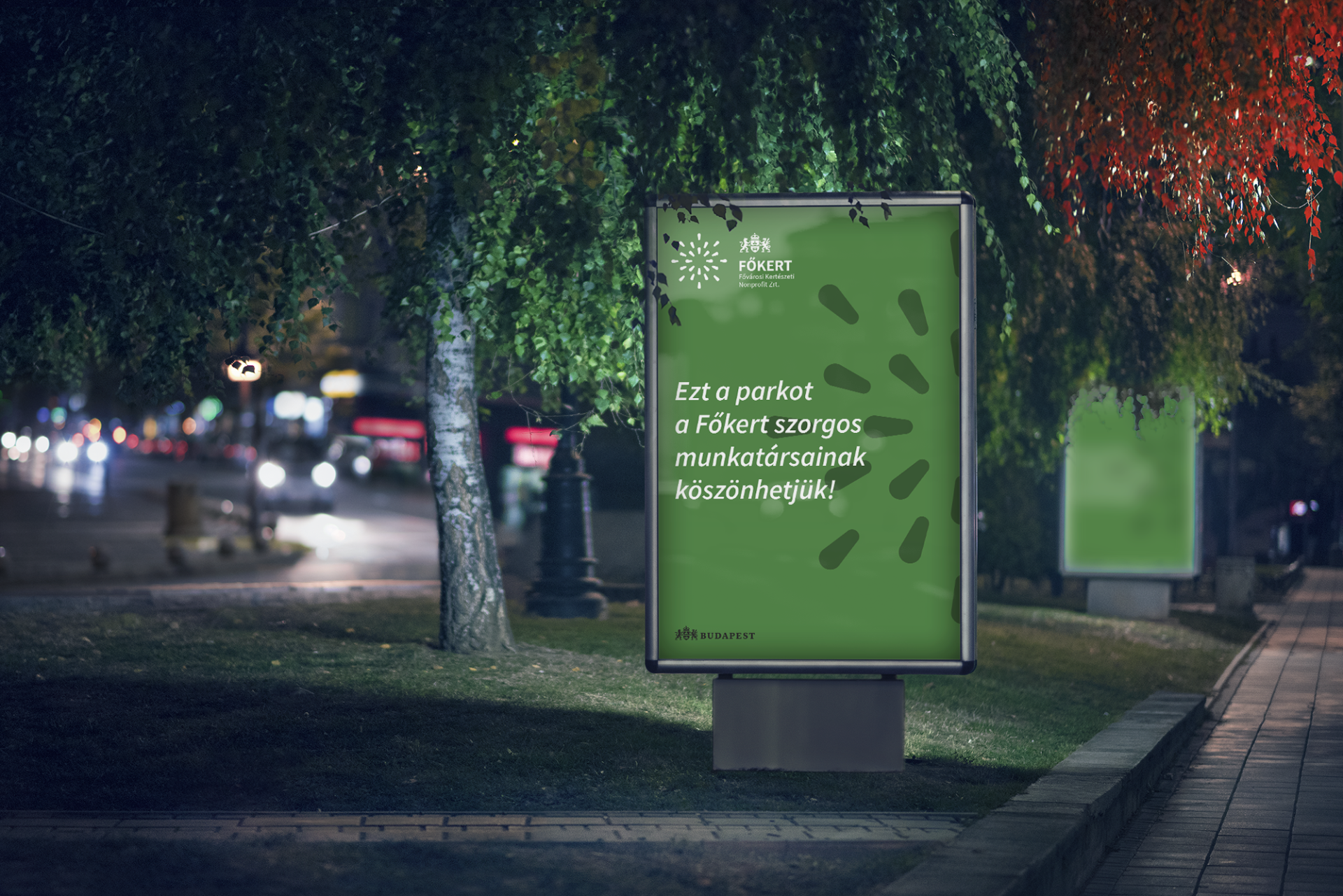
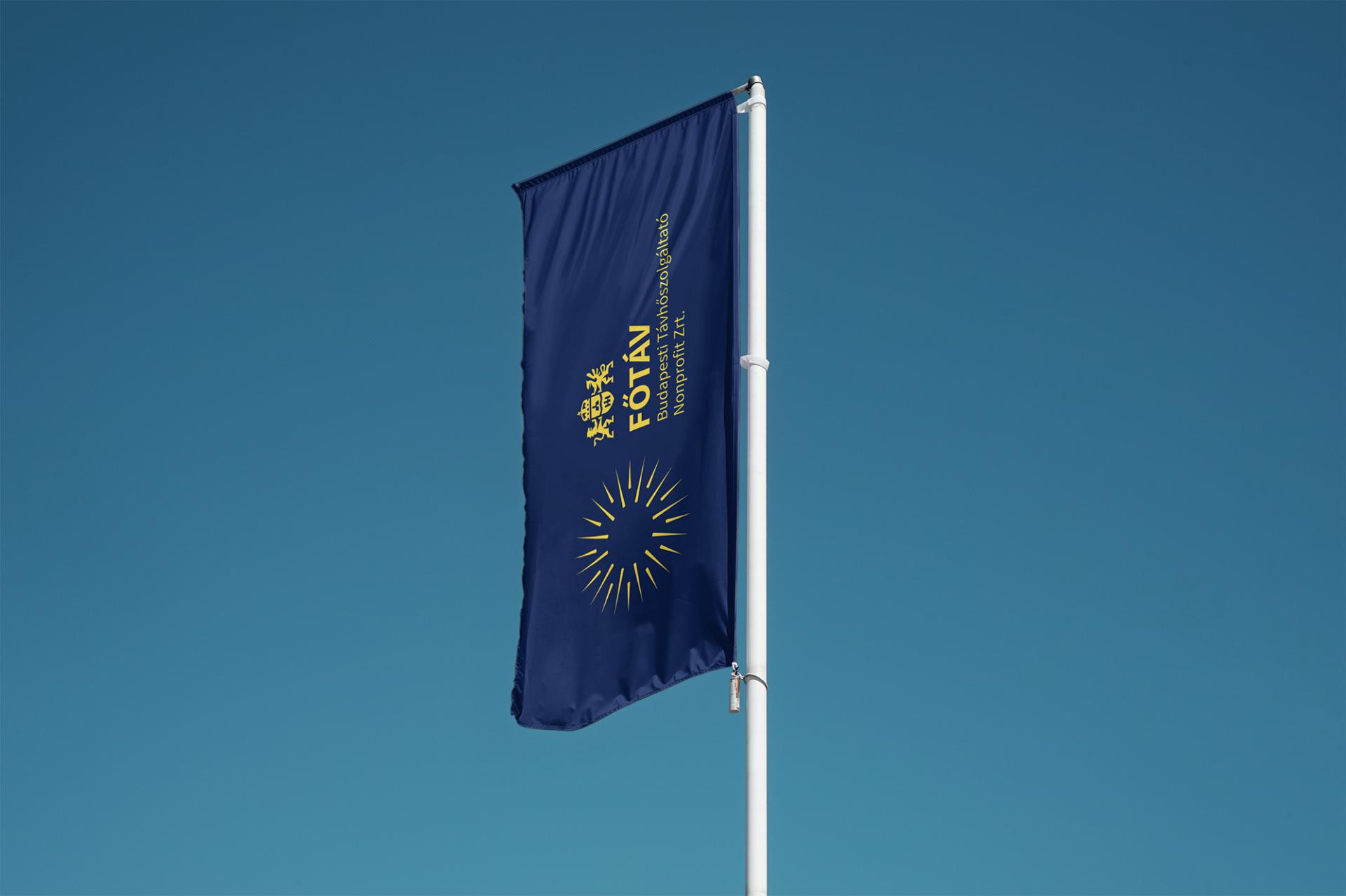
The council of Budapest is built up of more than 50 individual companies. We have designed a dynamic brand identity design system for these companies. All elements of the brand identity system can appear distinctively within the same styles.
Geographical Scope
Project Region
Urban or rural issues
Physical or other transformations
EU Programme or fund
Description of the project
Summary
Sustainability, broad-mindedness, equality: these inherent values of Budapest were put into a single graphic framework. With the help of a central grid system, we could define basic rules and proportions, which represent Budapest in a unique and consequent continent. Every organization's characteristics could be well defined with different shapes laid on the system — from landscaping to public lighting.
The modular identity brings safety and freedom simultaneously: the outcome smoothly fits into the bigger picture, meanwhile leaving room for the creative flow — even a tiny structural change results in a new visual world.
Each system element is based on a simple rectangle, which can be fundamentally changed by modifying its parameters. By changing specific parameters, the rectangle morphs into different shapes, and you won't even recognize the starting rectangle! Four different kinds of logic can be used to modify the basic shape that, combined with the grid system, enables the possibility of virtually infinite variations.
At the same time, the renewed symbol of Budapest preserved the symbolism of the old coat of arms: the wave line symbolizes the Danube, the one-tower castle Pest, the three-tower Buda, and the second gate of the Buda castle Óbuda. The keepers of the coat of arms date back to before the unification of the three cities, and the lion was in the coat of arms of Buda and the griffin in Pest.
Key objectives for sustainability
Sustainability was a key theme of the new image: we created a framework that a graphic artist, marketer, or even social media manager in any company in the capital could operate regardless of their qualifications. In addition, we strived to develop a simple and understandable design language so that the new brand identity can serve the purposes of the capital for a long time.
Key objectives for aesthetics and quality
The main strategic points of the new city management are sustainability, security, and diversity - these values have been translated into a new identity system. The main colors also represent this: in the spirit of sustainability, the green of city parks appears, the dark purple shade surrounds and provides security like a velvet armchair, and red simply vibrates like a diverse city. Our design process began with examining and researching the international and domestic identities that provided insight. The primary source of inspiration was the identity of Oslo, and we collected a defining set of associations that included words such as budding, growth, network, order, teamwork, community, and openness.
Key objectives for inclusion
During the design process, it was a mandatory outcome that whichever municipal company is being designed using our system, it has to be easily understood by the viewer that it is owned and operated by the city of Budapest. That is why, in addition to the generative emblems, we have also developed a complete system of proportions. Inclusivity is also reflected in the fact that advanced design skills are no longer required for creative design, thanks to a well-functioning graphic framework.
Results in relation to category
In the first year, five organizations have already implemented the umbrella design, and according to the city government's plan, all organizations will switch to this in the next four years. According to the experience of the first organizations, the new logo was successfully and smoothly developed, and the rules of the identity manual were put into practice. In addition, the image of Budapest won one of the most significant awards in Hungary, the RGB Creative Design Award.
How Citizens benefit
We started the design work based on an intensive, multi-day strategic workshop. Several people took part, ranging from the head of the Budapest Brand to the marketing department's staff. In addition, the local government also provided us with extensive research and design research, which provided a lot of information on the needs of the target audience and the strategic documentation.
Physical or other transformations
Innovative character
There has never been an example of such an extensive and multi-organizational identity update in Hungary, the scale of the design and the generative, modular approach are also new. We did not find any other domestic examples of toolkits designed to operate the identity.
Learning transferred to other parties
A generative and modular approach can be exciting for any company or organization, simply developing a well-functioning ratio system and designing components that harmonize with each other. This kind of design can be thought of as making a cocktail, where we give in advance what flavors and drinks blend well with each other, after which you can experiment and design freely. Before all this, however, a strategically focused, engagement-based workshop is essential where we can lay out the fundamental ethos and strategic principles of the new identity based on the participants' inputs. Following this method will result in a self-identical, authentic, and human-centered brand.

