Arts, Culture, and Heritage as Drivers of Change
Divergent Frequencies
Divergent frequencies: Creating a more accessible environment through parametric typography
Divergent frequencies addresses low vision by redefining legibility through Ivy Flex, a parametric typeface tailored to individual needs. Unlike standard solutions, Ivy Flex adjusts 5 key variables to create personalized adaptations for each user and context. This approach empowers readers with low vision, enhancing quality of life. The project is unique in its focus on personalization, transforming the understanding of legibility, and setting a new standard for inclusive typographic design.
Spain
National
Mainly urban
It refers to other types of transformations (soft investment)
Early concept
No
No
No
Individual
large number of people worldwide are affected by low vision, often facing the challenge of performing basic tasks like reading, which diminishes their independence and quality of life. Moreover, there is a trend focused on standardizing legibility through uniform adjustments, but this approach often overlooks the individual needs of each reader. Every reader’s vision is different, and every context presents new challenges — legibility cannot be one-size-fits-all. It must be personalized, allowing each person to experience reading in a way that truly suits them. Recognizing this, we developed a typographic design and methodology that adapts to each user, ensuring inclusivity regardless of their abilities.
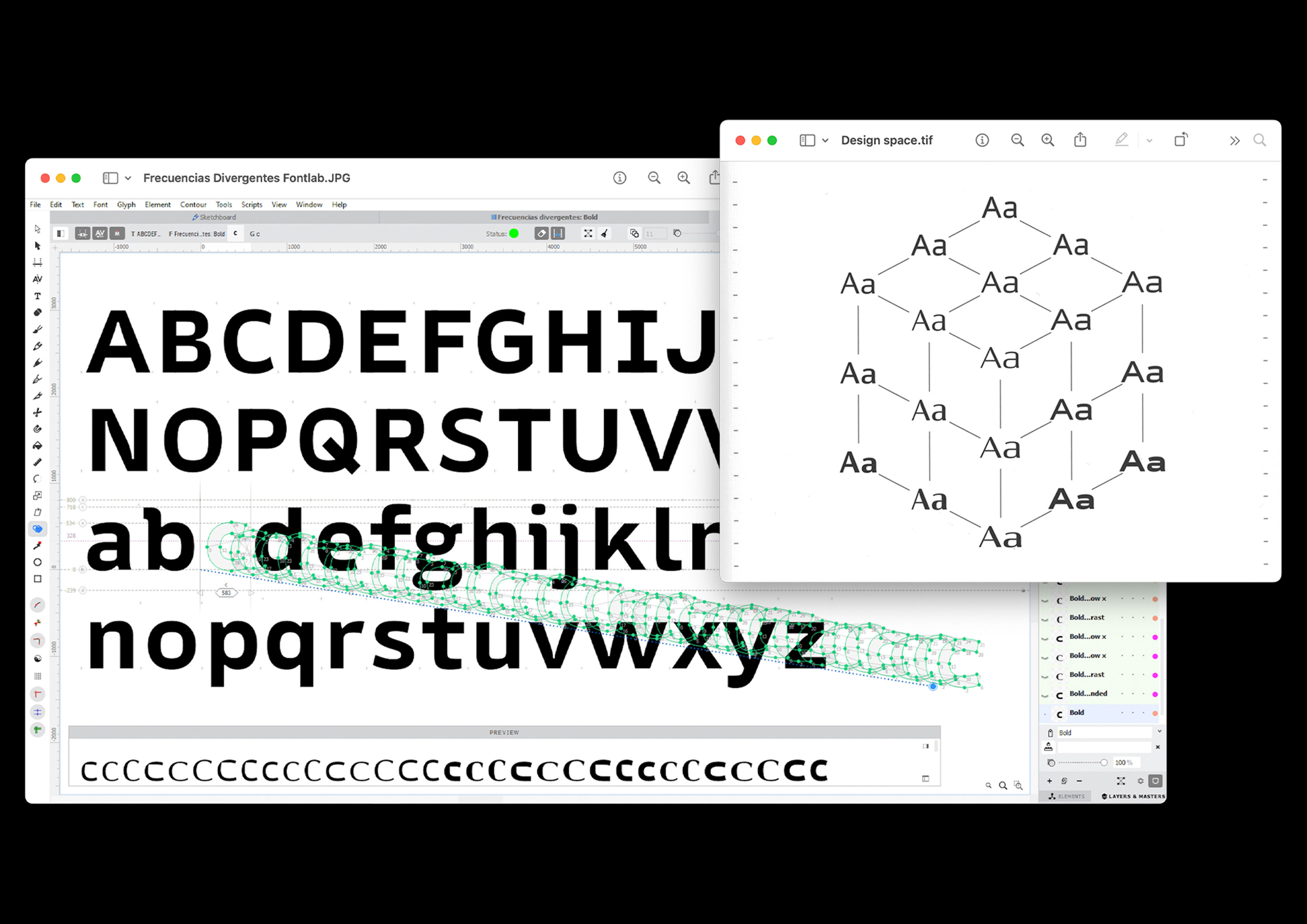
Frecuencias Divergentes (Divergent Frequencies) addresses low vision in reading by redefining legibility beyond the norm. The result is Ivy Flex, a parametric typeface that adapts to various visual conditions. With five adjustable variables — weight, width, contrast, m-formula, and x-height — Ivy Flex allows for precise adjustments, creating customized adaptations for each user and context.
However, Ivy Flex is not intended to be the most legible typeface in an absolute sense. Instead, it seeks to transform the way we understand legibility, offering a personalized solution that adapts to the unique needs of each reader. This flexible approach not only improves reading performance but also opens the door to more precise studies on legibility. Ivy Flex combines functionality and aesthetics, showing how personalization can overcome standard solutions and offering a tool that improves the quality of life for users with low vision, both in print and digital formats. With this project, not only are current challenges addressed, but a more inclusive future is promoted, where typographic solutions adapt to the visual diversity of each individual.
Frecuencias Divergentes (Divergent Frequencies) addresses low vision in reading by redefining legibility beyond the norm. The result is Ivy Flex, a parametric typeface that adapts to various visual conditions. With five adjustable variables — weight, width, contrast, m-formula, and x-height — Ivy Flex allows for precise adjustments, creating customized adaptations for each user and context.
However, Ivy Flex is not intended to be the most legible typeface in an absolute sense. Instead, it seeks to transform the way we understand legibility, offering a personalized solution that adapts to the unique needs of each reader. This flexible approach not only improves reading performance but also opens the door to more precise studies on legibility. Ivy Flex combines functionality and aesthetics, showing how personalization can overcome standard solutions and offering a tool that improves the quality of life for users with low vision, both in print and digital formats. With this project, not only are current challenges addressed, but a more inclusive future is promoted, where typographic solutions adapt to the visual diversity of each individual.
The project arises from the question of whether we can create typography that goes beyond the traditional, and whether it can help people who face difficulties and are often left isolated because design does not take them into account. From this question, an idea emerges: to create a custom (ad hoc) typeface for each person, adapting to their needs, abilities, and context.
Each situation is different, which is why parametric typography was used to generate multiple interpolations that allow the creation of many variations, modifying the formal morphology of the typeface. In this way, the letters could adapt to the user, instead of the user having to adapt to them. The user and their context define the final result and morphology of the project.
The project does not aim to create a typeface that is better for everyone, but rather a typeface that adapts to and takes advantage of the individual abilities of each person. Typography, as a fundamental tool of communication, should not be a barrier. With this project, we promote the development of inclusive typefaces that respect visual diversity and guarantee the right to reading and access to information, ensuring equal opportunities for all people, regardless of their abilities.
Each situation is different, which is why parametric typography was used to generate multiple interpolations that allow the creation of many variations, modifying the formal morphology of the typeface. In this way, the letters could adapt to the user, instead of the user having to adapt to them. The user and their context define the final result and morphology of the project.
The project does not aim to create a typeface that is better for everyone, but rather a typeface that adapts to and takes advantage of the individual abilities of each person. Typography, as a fundamental tool of communication, should not be a barrier. With this project, we promote the development of inclusive typefaces that respect visual diversity and guarantee the right to reading and access to information, ensuring equal opportunities for all people, regardless of their abilities.
Parametric typography
Low vision
Accesibility
social inclusion
Adaptative design
The project addresses sustainability mainly from a social perspective. Access to reading and information is a fundamental part of participation in society, yet many typographic systems are designed around a standardized reader and do not consider the diversity of visual or cognitive abilities. As a result, some people experience difficulties that can lead to exclusion from written communication.
This project proposes a different approach by developing a parametric typographic system that can adapt to the needs, capacities and context of each user. Instead of forcing people to adapt to fixed letterforms, the morphology of the typeface can change through multiple interpolations, allowing the letters to respond to individual conditions. In this way, the user and their context define the final form of the typeface.
By promoting adaptable and inclusive typography, the project contributes to social sustainability by reducing barriers to reading and supporting equal access to information. It also encourages a more responsible design approach, where communication tools are developed with diversity in mind. Rather than proposing a universal “better” typeface, the project demonstrates how flexible systems can respect individual differences and create more inclusive forms of visual communication.
This project proposes a different approach by developing a parametric typographic system that can adapt to the needs, capacities and context of each user. Instead of forcing people to adapt to fixed letterforms, the morphology of the typeface can change through multiple interpolations, allowing the letters to respond to individual conditions. In this way, the user and their context define the final form of the typeface.
By promoting adaptable and inclusive typography, the project contributes to social sustainability by reducing barriers to reading and supporting equal access to information. It also encourages a more responsible design approach, where communication tools are developed with diversity in mind. Rather than proposing a universal “better” typeface, the project demonstrates how flexible systems can respect individual differences and create more inclusive forms of visual communication.
Typography is a constant presence in everyday environments, from books and screens to public signage and shared information systems. The visual quality of these letterforms influences how people experience reading and how welcoming written communication feels in daily life. This project explores how adaptable typography can contribute to more thoughtful and visually balanced communication.
Using a parametric system, the project allows the structure of the letters to change while maintaining coherence in proportion, rhythm and overall composition. This makes it possible to generate different typographic variations that remain visually consistent while responding to different reading conditions.
An important part of the project was to ensure that accessibility did not mean sacrificing visual quality. Design solutions for people with low vision are often treated as purely functional, with little attention to aesthetic value. This project challenges that idea by treating aesthetics as an essential part of accessible design.
By combining adaptability with careful formal design, the project proposes a typographic approach where clarity, beauty and usability coexist. In this way, typography becomes not only easier to read, but also more engaging and respectful of the visual experience of different readers.
Using a parametric system, the project allows the structure of the letters to change while maintaining coherence in proportion, rhythm and overall composition. This makes it possible to generate different typographic variations that remain visually consistent while responding to different reading conditions.
An important part of the project was to ensure that accessibility did not mean sacrificing visual quality. Design solutions for people with low vision are often treated as purely functional, with little attention to aesthetic value. This project challenges that idea by treating aesthetics as an essential part of accessible design.
By combining adaptability with careful formal design, the project proposes a typographic approach where clarity, beauty and usability coexist. In this way, typography becomes not only easier to read, but also more engaging and respectful of the visual experience of different readers.
This project addresses inclusion by questioning the idea that one typographic solution can work equally well for everyone. Reading abilities vary widely due to visual conditions, cognitive differences, age or context, yet most typefaces are designed around a standardized reader. As a result, many people must adapt to systems that were not designed with their needs in mind.
The project proposes a parametric typographic system that allows the morphology of the letters to be adjusted according to different reading conditions. Instead of offering a single fixed typeface, the system can generate multiple variations by modifying parameters such as weight, spacing or proportions. This flexibility allows the typographic form to adapt to different users and contexts.
An important aspect of the project is the intention to take advantage of the individual abilities of each person, rather than designing only around limitations. By moving away from a single standard, the system allows the typography to respond to the strengths, preferences and visual capacities of each reader.
In this way, the project promotes a more inclusive design approach in which diversity is not treated as an exception, but as a starting point for developing communication tools that can respond to a wider range of people and situations.
The project proposes a parametric typographic system that allows the morphology of the letters to be adjusted according to different reading conditions. Instead of offering a single fixed typeface, the system can generate multiple variations by modifying parameters such as weight, spacing or proportions. This flexibility allows the typographic form to adapt to different users and contexts.
An important aspect of the project is the intention to take advantage of the individual abilities of each person, rather than designing only around limitations. By moving away from a single standard, the system allows the typography to respond to the strengths, preferences and visual capacities of each reader.
In this way, the project promotes a more inclusive design approach in which diversity is not treated as an exception, but as a starting point for developing communication tools that can respond to a wider range of people and situations.
The project is currently in a prototype stage, which means it has not yet been directly tested with users with low vision. However, the development of the concept has been strongly informed by existing research and studies that have worked directly with these communities. The project builds on knowledge from previous investigations in typography, accessibility and visual perception that analyse how different typographic features affect readability for people with visual impairments.
A key part of the process has been combining design practice with insights from other disciplines such as neuroscience, psychology and vision science. This interdisciplinary approach helped guide the definition of parameters such as contrast, spacing, proportions and letter structure, ensuring that design decisions were not based only on aesthetic intuition but also on documented research about how people perceive and process written forms.
Because the system is parametric, it has been conceived from the beginning as a framework that can incorporate user feedback in future stages. The next step of the project would involve direct testing with users to refine the typographic variations and better understand how different individuals interact with them.
In this sense, the concept has been developed with a strong research-based foundation and is designed to evolve through future collaboration with users and stakeholders.
A key part of the process has been combining design practice with insights from other disciplines such as neuroscience, psychology and vision science. This interdisciplinary approach helped guide the definition of parameters such as contrast, spacing, proportions and letter structure, ensuring that design decisions were not based only on aesthetic intuition but also on documented research about how people perceive and process written forms.
Because the system is parametric, it has been conceived from the beginning as a framework that can incorporate user feedback in future stages. The next step of the project would involve direct testing with users to refine the typographic variations and better understand how different individuals interact with them.
In this sense, the concept has been developed with a strong research-based foundation and is designed to evolve through future collaboration with users and stakeholders.
The project is designed to engage stakeholders at multiple levels. Locally, it could involve schools, libraries, and community organizations to ensure the typographic system meets everyday accessibility needs. Regionally, partnerships with design institutes, accessibility advocacy groups, and public services could support testing and dissemination. At a national and European level, collaboration with research centers, policymakers, and standards organizations could help align the system with inclusive design guidelines and accessibility regulations.
The goal is not only to create a single product, but also to develop a methodology that others can apply in their own design processes. By embedding principles of adaptability and inclusion, the project serves as a reference tool, encouraging more designers to create accessible, flexible typography and incorporate these values into broader design practices across Europe.
The goal is not only to create a single product, but also to develop a methodology that others can apply in their own design processes. By embedding principles of adaptability and inclusion, the project serves as a reference tool, encouraging more designers to create accessible, flexible typography and incorporate these values into broader design practices across Europe.
The project brings together multiple disciplines to ensure a rigorous and holistic approach. Design and typography form the core, guiding the visual and functional aspects of the typeface. Neuroscience and psychology inform how people perceive and process written information, particularly for those with visual or cognitive differences. Digital technologies enable parametric systems that generate adaptive letterforms efficiently. Education and accessibility research contribute insights on inclusive communication practices. Additionally, insights from social sciences and human-centered design help understand user needs and context. By combining these fields, the project creates a transdisciplinary framework where formal design, user experience, and scientific evidence converge, allowing the creation of typography that is both functional and adaptable while serving as a reference for inclusive design practices.
The envisioned business model focuses on combining service, research, and knowledge-sharing. The core offering is a parametric typographic system and methodology that can be licensed to design studios, educational institutions, and public organizations. Revenue could also come from workshops, consultancy, and training programs on inclusive typography and adaptive design practices. Public funding, grants, and collaborations with accessibility-focused organizations would support development and research phases. Additionally, open-access resources and case studies could be offered to encourage adoption and raise visibility, while premium tools or custom adaptations generate income. By balancing revenue-generating services with knowledge dissemination, the model ensures financial sustainability while promoting wider implementation of inclusive design principles.
The project’s core strength lies in its methodology rather than a single product, making it highly scalable. The parametric system and design principles can be applied to create typography for different languages, scripts, or user groups with varying abilities. The approach can also be adapted to educational materials, digital interfaces, signage, or public communication tools in diverse contexts. Key learnings about combining accessibility, aesthetics, and adaptability can guide other designers and organizations in creating inclusive design solutions. By offering a replicable framework rather than a fixed solution, the project enables broader adoption, allowing communities, institutions, and designers across regions to implement flexible, user-centered typography tailored to their specific needs.
In the year following the application, the project will continue to focus on developing and refining the typographic prototype. This phase will allow further exploration of the parametric system and its ability to adapt to different users’ needs, while continuing to expand the underlying research on accessibility, visual perception, and inclusive design. The emphasis will be on iterative development, testing concepts internally, and deepening the interdisciplinary framework that informs the project. This period will also provide opportunities to explore potential applications, gather early feedback from experts, and strengthen the methodology as a reference for future design processes. The project shows strong potential but will require ongoing refinement and investigation before broader implementation.